OLD VS NEW
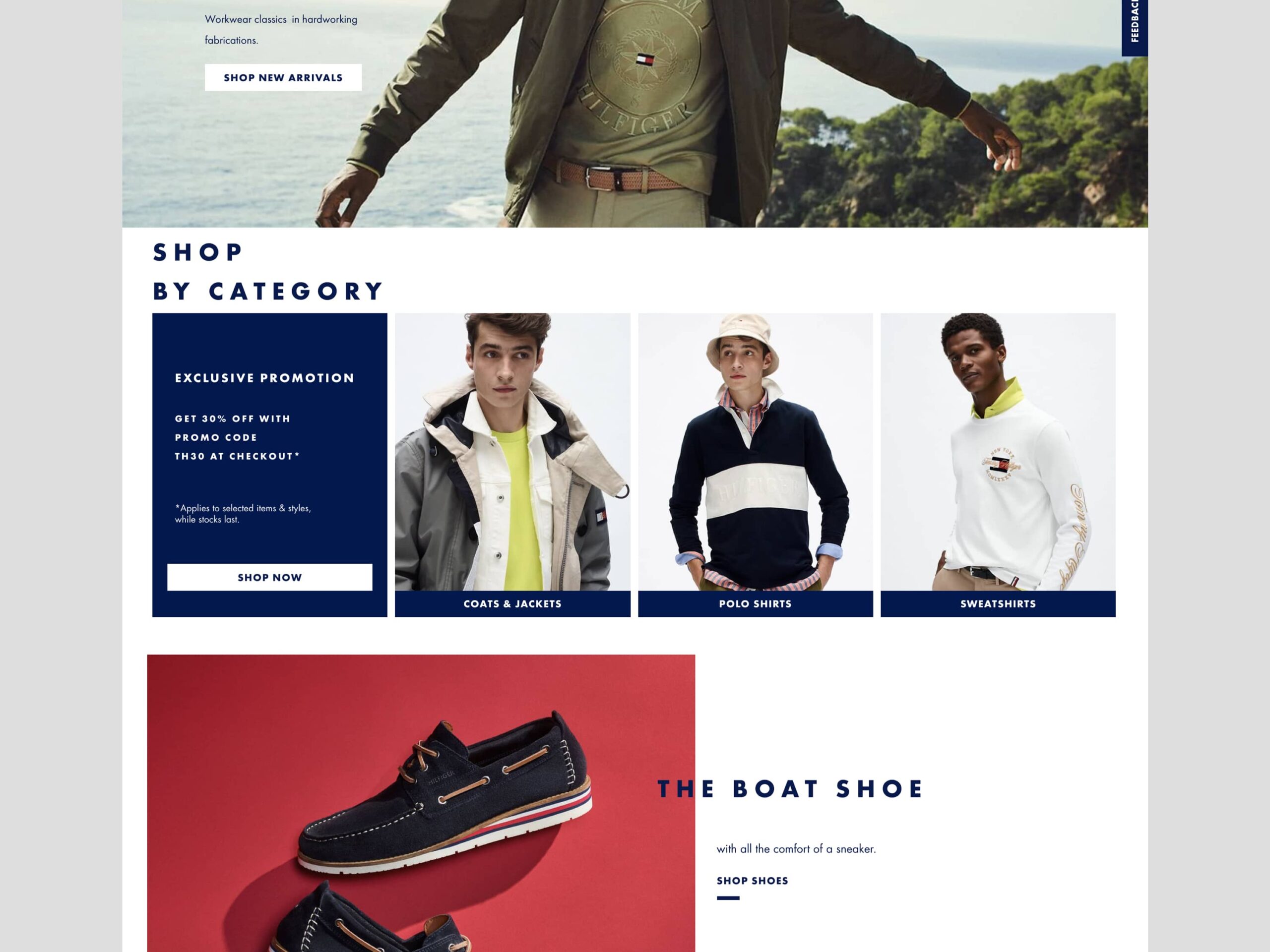
Shown here is the old designed category entry module. Which has some notable interesting design elements. But most of all there was always a need to have four category entries. We needed something more flexible, legible, and with a fresh coat of paint.
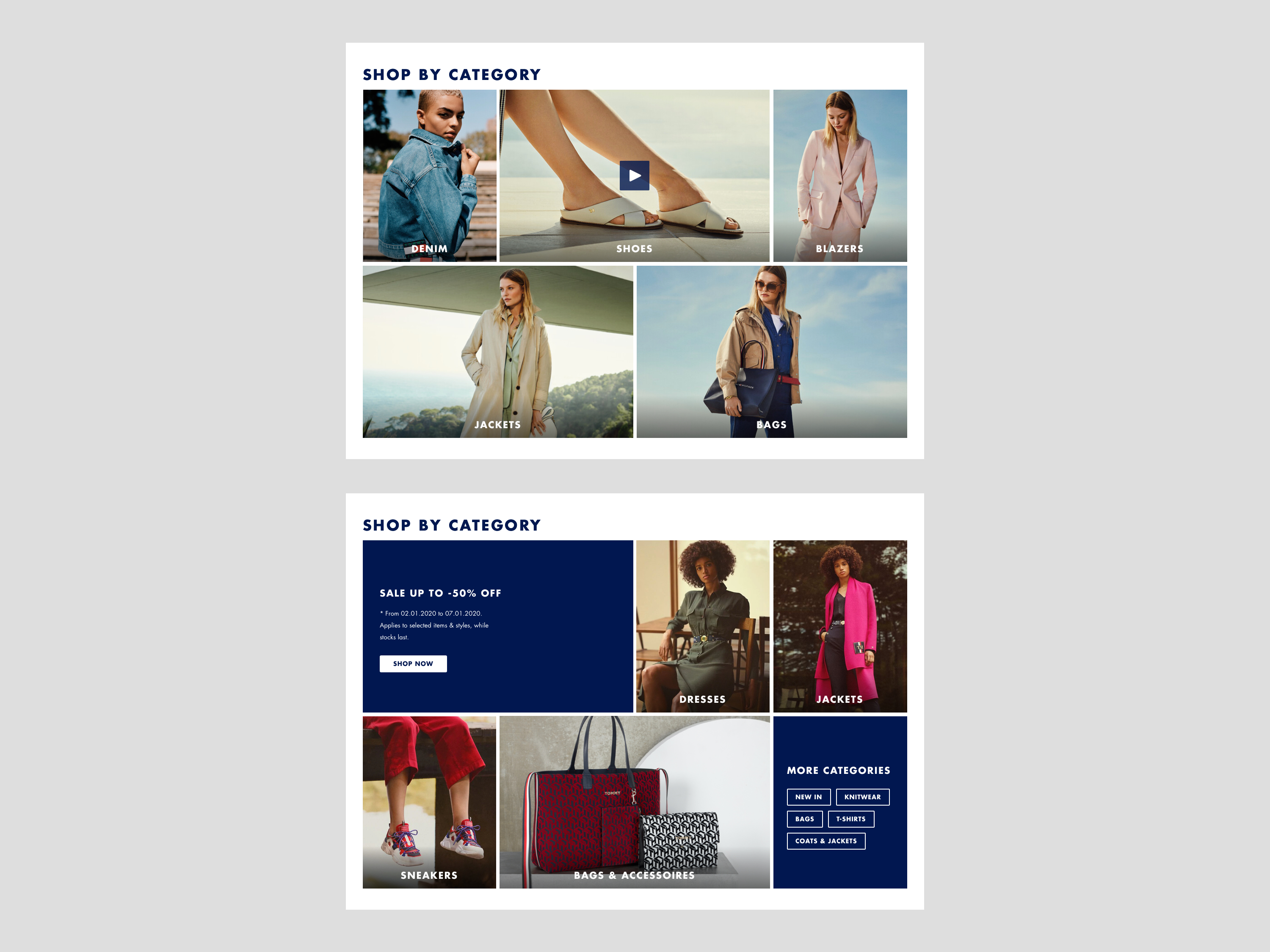
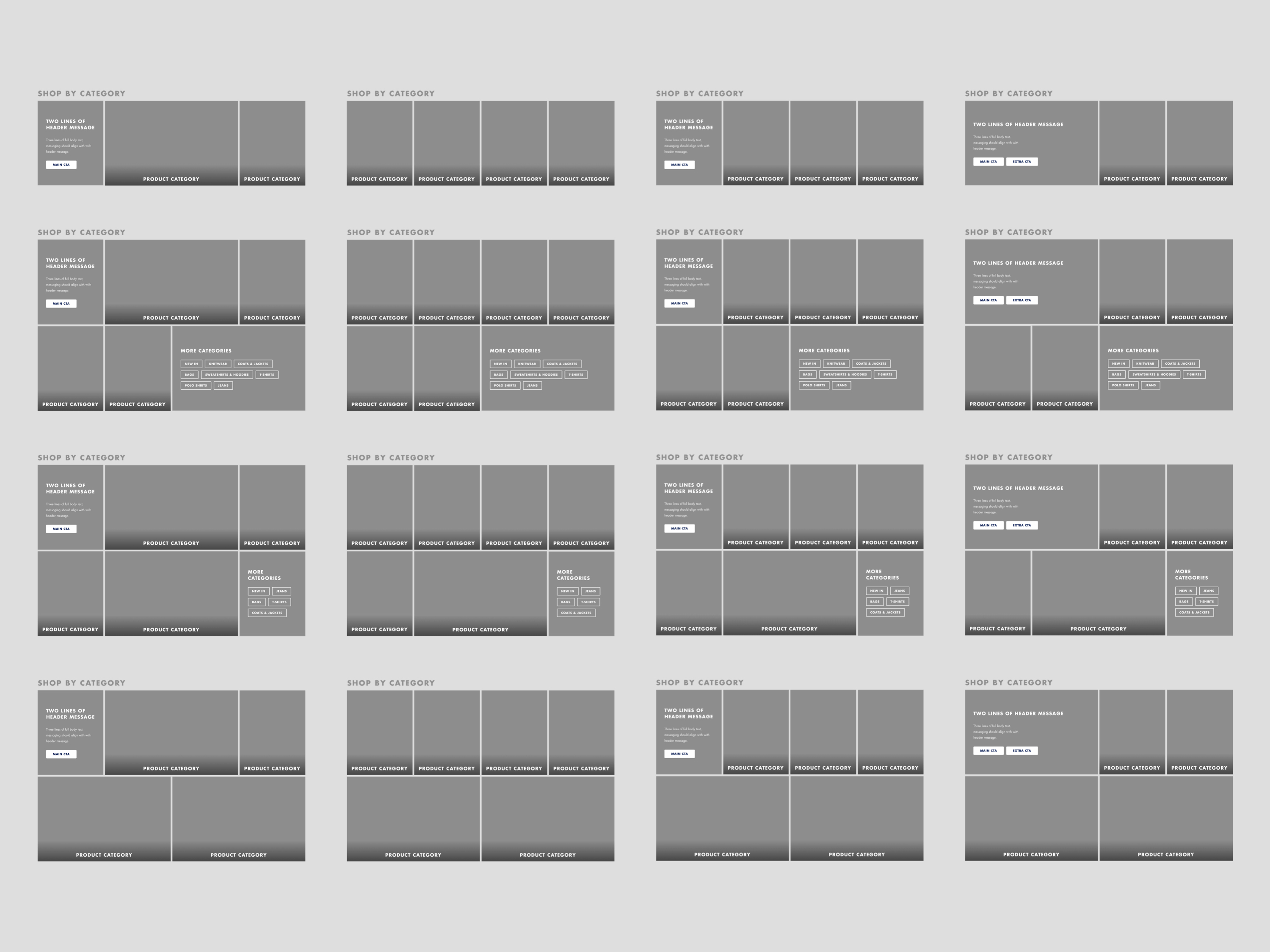
The new category entries are built as little lego blocks where the content team of Tommy Hilfiger can pick and choose out of more than 16 different looks and possibilities. In turn, this module can be updated daily or weekly and completely change style and function without changing the content.


FINAL DESIGN
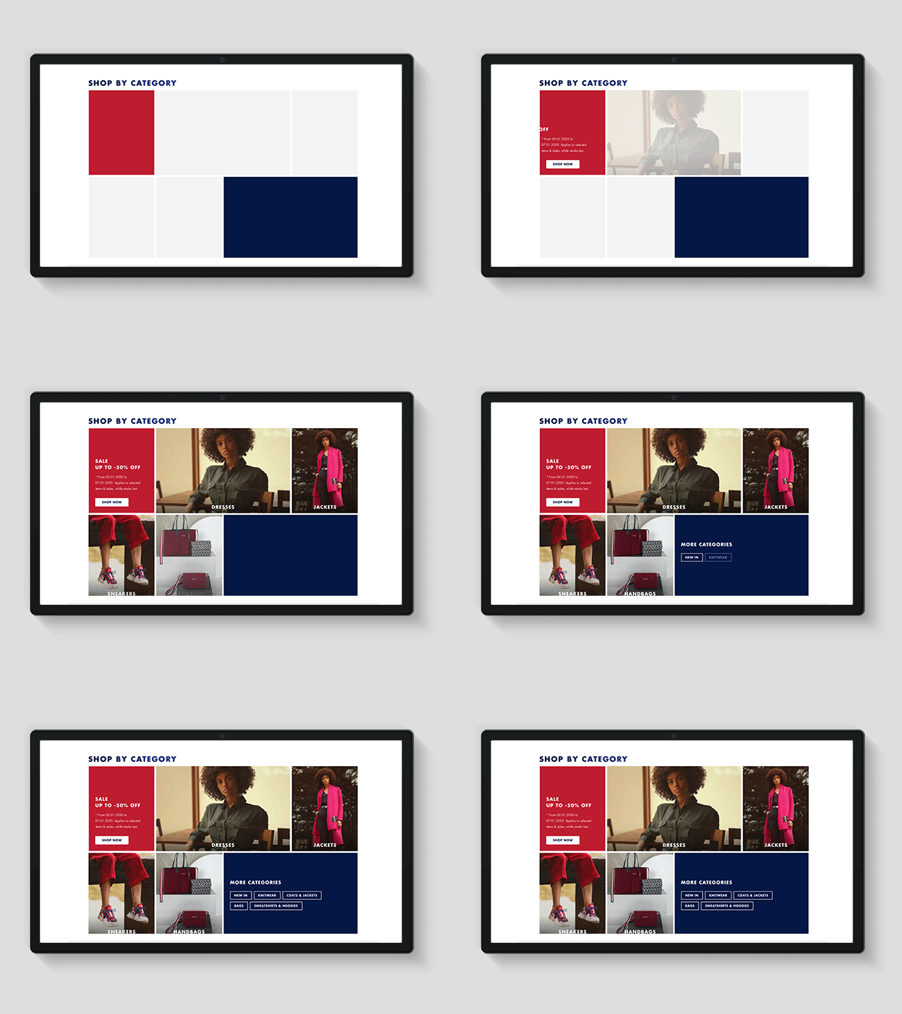
The final design is here shown animated. Loading animations show the customer that something is happening, and it will entice the customer to use the module. We A/B tested this against the old category module and saw an increase in interactions. A notable extra is our categories are visible in one glance so you only need to decide what to shop.