DEFINING THE PROBLEM
Size is one of the most important aspects of clothing if it doesn’t fit right you have a high chance of an unhappy customer. At Tommy Hilfiger, we noticed a lot of returned orders were not because of the design or price but because the fit wasn’t as aspected. After some initial research, we found out that the size guide had unusually high traffic. The problem was we’re not clear with our sizing, especially when a customer is in between sizes we noticed a lot of uncertainty.
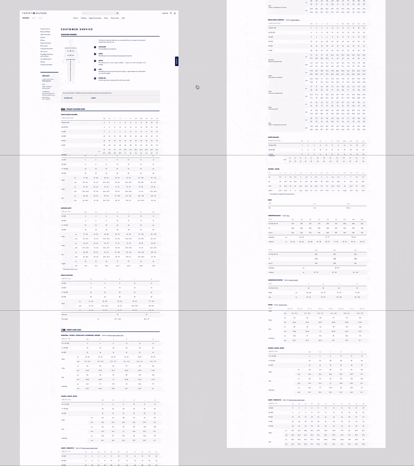
The main focus point was when a customer was shopping for a product and was uncertain about the size, the customer needed to refer to our size guide. The issue here is our size guide was a separate page and all our data was visible in one table. But if it anchors down it will be fine right? Well, it didn’t.


BENCHMARK SET AND GO
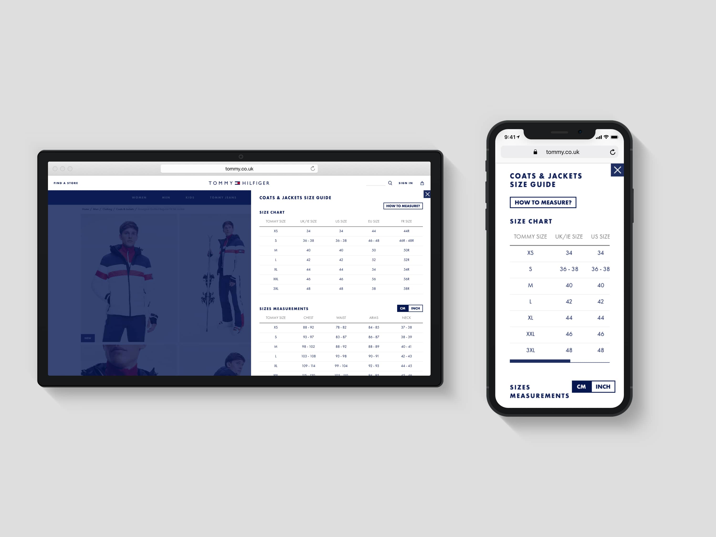
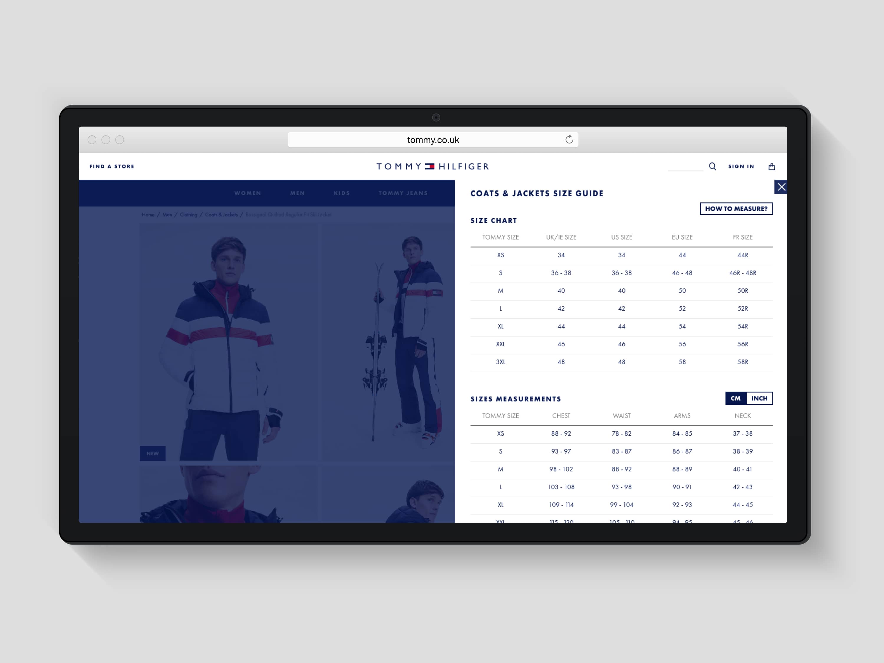
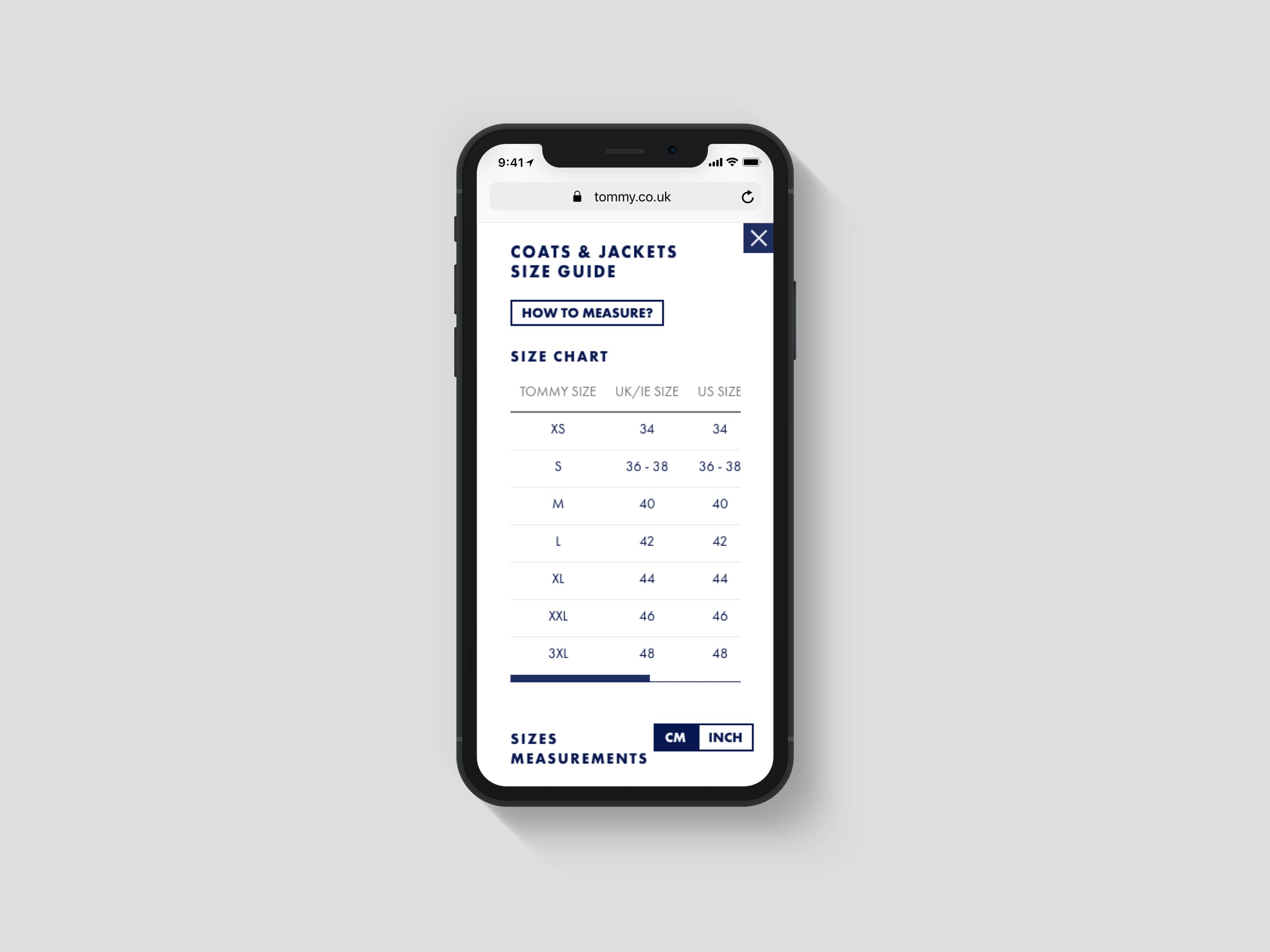
After a brainstorming session and benchmarking session we wanted to show relevant information without interrupting the flow of the customer. We solved this issue mentioned above by showing the relevant sizing information of the product a customer is currently viewing. After multiple design iterations, we settled on a slide out with the relevant information directly visible. We then decided to A/B test this solution and see the data behind this design and hypotheses, we successfully ended the A/B test and noticed a decrease in returns, and an uplift in revenue.

