THE MISSION
User test after User test learned that we have two types of customers. Customers who want to be inspired and want to engage with the brand. The opposite crowd just wants to shop, and they want to do it as quickly as possible.
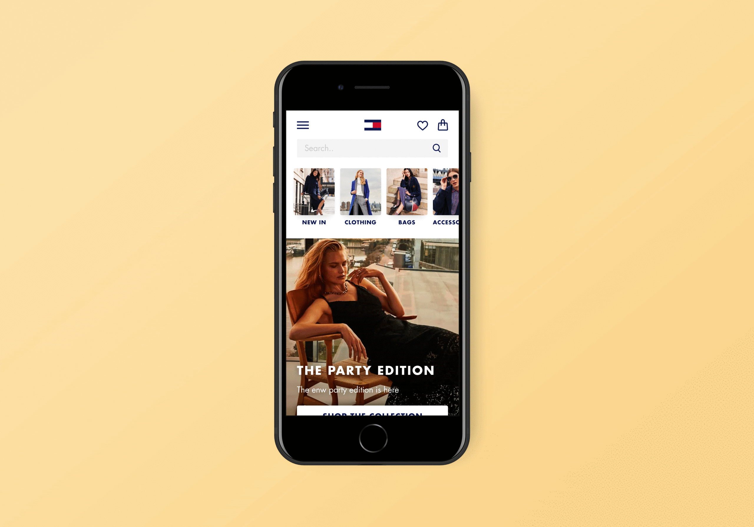
To cater to the latter, we designed and developed our category entry points directly on the homepage, for mobile-only.


TESTING TESTING AND TESTING
Our hypothesis was as followed, by showing the consumer direct options to shop on our homepage they’re more likely to end up in our happy flow, which will hopefully translate to a better conversion rate.
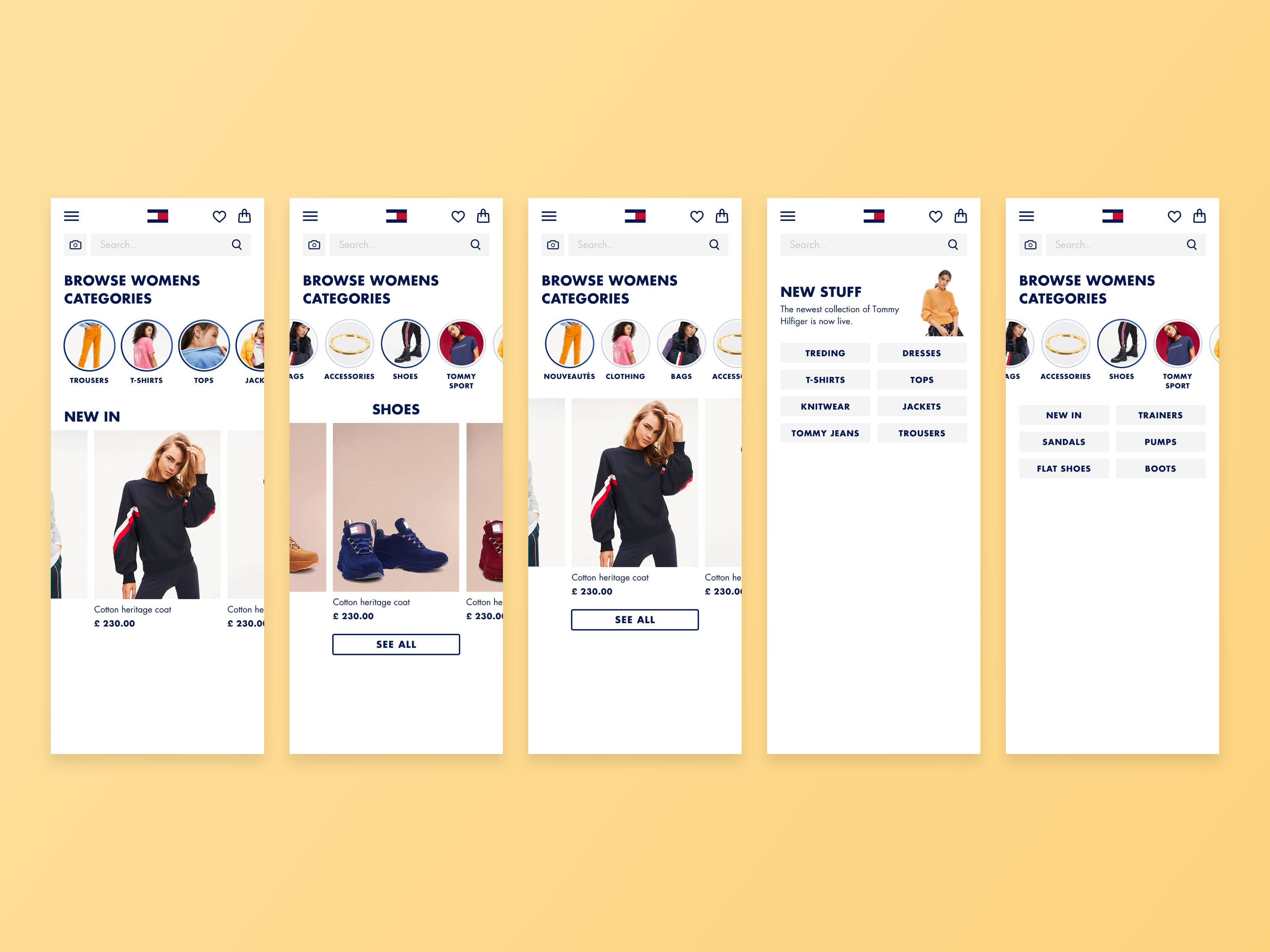
After settling on our hypothesis some initial ideas were designed and user-tested. After a round of user testing, the preferred solution by our customers was the one with only links visible. So we continued with our journey.
THE FINAL
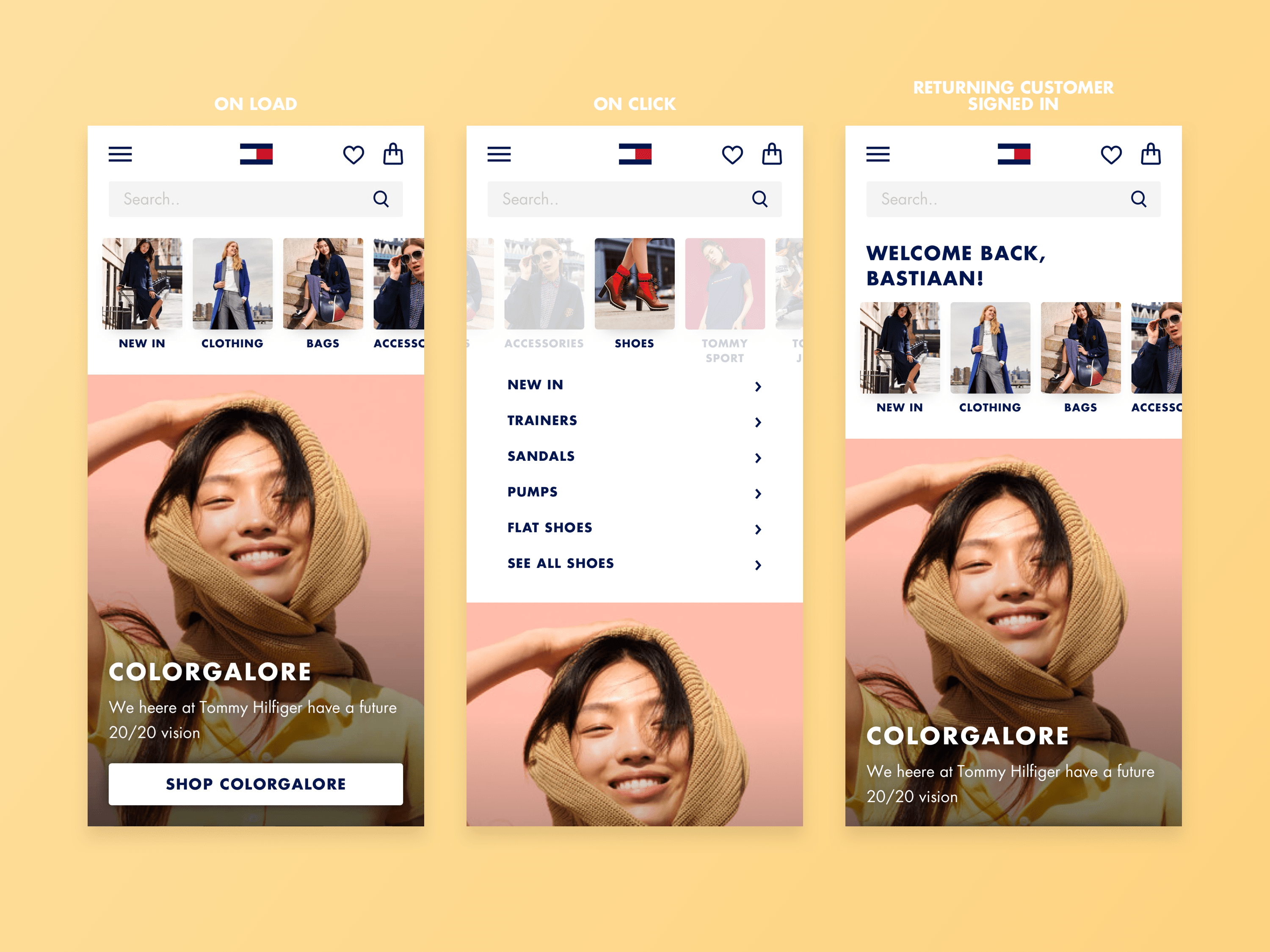
After finalizing the designs and A/B testing our results were in, and we noticed an uplift in conversion and switching between categories. The next step is development. For the curious, there is a prototype link to one of the examples made for our development team.
